Wednesday 19 October 2011

ZIPANGU FEST Poster Design

Well, it's been a while away from personal projects - but for mostly good reasons. Freelance, freelance, freelance; a tripple whammy of jobs with deadlines this month. So whilst comic drawing has been on hold - here's the results of one of those aforementioned freelance pieces.


This final image was designed for the front cover of Zipangu's film times programme. Anyone with an interest in indie/Asian cinema should check out some of the titles they're screening.

The final image brings together a big kaboodle of Japanese myths and monsters, mixed with elements from some of the films on show this year. It was drawn first in pencils (see below) then outline inked with rapidograph, watercoloured and inked with thicker lines/flat black fills. Having rarely strayed into the world of super technicolour - I think I was a tad overzealous with my bright colour scheme and balance, but it required something bolder than my usual shades of green and grey and generally muted pallete.


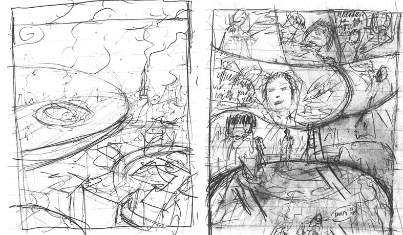
The lower image shows my initial response to the job; utilising a Pandora's Box as a means to explain the horde of creatures and objects surrounding our main schoolgirl figure. These layout, thumbnail sketches show a few different takes on the general theme. Fei, a producer for Zipangu, was eager to incorporate a cityscape of some sort in the final design - so we opted for a kind of Mary Poppins, flying over the city approach. Superkalifragelisticexpialidocious - Ah Francine you were a good enough babysitter for the young me, but you were no Julie Andrews.


Sunday 7 August 2011

MBTF#2 - Toby in the 'Chaser upstairs


Bit of interior decoration going on here - albeit after a booze sodden party night. With three people living above the Red Eyed Chaser pub - there's a fair bit of clutter/kipple accumulation going on. We'll explore this further down the line.

Fun aspects of this drawing include band posters/holograms, demon sculpted lamp and small brew labels (In this case - the Mercurial Malting Mothers and their Old Lucky 13%)

Thursday 28 July 2011

Inked - animated sequence


Here is the inked 'boy trying to catch a pigeon' sequence with a few position tweaks in After Effects.

To save animation paper - I traced the pencil drawing on the reverse side of each frame with a fine line pen and scanned into the computer. For the most part, the scanner only picks up on the ink line drawing, leaving the pencil on the reverse invisible.

Pencil Test Reel 2011


Another sequence drawn up for the opening shot of my 2011 reel.

To use 'pencil test' in the title is perhaps a bit misleading, as I tend to always stick to my original pencil frames when tracing in ink - then tweak in After Effects. This particular sequence required a bit of extra height in the kid's jump.

The exaggerated perspective made this one a little tricky - I wanted the head blown up in size and close to the camera - with a steep narrowing of the angle towards the feet. The resulting animation is choppy as hell! But when composited in the background, I think it's passable.

MOTION GRAPHICS REEL 2011


Some select cuts from recent motion graphics/animated work. Mostly from my tenure at the QVC studios in London, with a few self initiated projects thrown in for good measure.

Design/Animation: Michael Lomon
Music: Batdance by Prince ©Warner Bros

Whilst I tend to avoid posting work 'work' related posts on this blog, there's a short animated sequence at the start of this reel that's linked to a drawing originally in the CRIMINAL #1 comic - so it's all inextricably linked you see!

Tuesday 28 June 2011

PAZ: Character Sketch


Appearing for the first time in MBTF#2 is Paz - subject to a hefty dosage of mutation during the Ultralima disaster, (that means nothing to anyone just yet i'm afraid, but don't worry dear - everything will fall into place!) Paz is blessed/cursed with an extra pair of hands or two along with some facial, optic deformation. She resides above the Red Eyed Chaser bar with her two older brothers. I'd tell you more but it's getting late and this UK heatwave humidity onslaught is sweating my senses dry.

Tuesday 14 June 2011

Page 7 MBTF#2


Pencilled MBTF page including the first rendering of The Red Eyed Chaser public house as seen in the previous blog post in sketch form. This building is FUN to draw!

Slightly less fun to draw is the machinery seen in the bottom layer of panels. The idea here involves a primitive release mechanism for a secured ladder, leading to the elevated back door of the Chaser - only for those in the know of course - friends and family of the establishment.

Whilst my personal understanding of physical force meets mechanical design is somewhere in the region of limited to nill - This contraption has been put together by someone with a mind for DIY in the comic world - slipshod though it may be. Therefore, the release should work, if only theoretically, in a distant dream, in my mind. You'll have to trust me - but if everything were weighted and counterbalanced correctly - this mess of cogs and springs would 100% work - I swear it.

This is perhaps the sort of thing that works more effectively in animation; Wallace and Gromit being the obvious go to point for madcap, intricate, domino effect inventions. But hey - No Pain, No Gain Baby.

Wednesday 1 June 2011

MBTF#2 - The Red Chaser Designs

Rough pencil concept sketch for a public house in the Chrome sector of Nova City.


The general idea is that of a Heavy Metal bar built of metal/plastic scraps from a vehicle manufacturing trade now extinct in this comic book world.


The rest of the sector will follow similar stylistic tendencies, but the 'Chaser has had that extra bit of care and attention laid out in it's eagerness to impose and impress.


The demon sculpted into the wall is an idea inspired by a metal karaoke bar easily spotted for anyone who has ever had the opportunity to walk around Shinjuku - Tokyo.


Killer!

Thursday 19 May 2011

MBTF#2 Underway!


Having spent a month or so straightening out the chaos that resembles story progression in the world of Metal Between Two Faces - issue 2 is now being pencilled.

In my world, things tend to get underway with large chunks of sprawling, spidery text in note books, followed by rudimentary script and text descriptions panel by panel, then quick layout thumbnail sketches in pencil or ink.


Only after the entire issue is layed out and the pacing seems to flow, do I start considering the nitty gritty details such as, how the hell do people look in a world like this? What do they wear? Does George Lucas use his facial hair to hide a double chin successfully or does it simply draw attention? If beer and tea both contain laxative elements - am I slowly but surely dehydrating due to a reluctance to drink plain water etc..


These initial sketches tend to get mangled up and re-formed once the real drawing starts. Kinks like exaggerated face lengths and generous noses/moles/growths crop up as the characters flesh themselves out on the page. In fact, once I start drawing at full scale, I tend to deviate from the initial layout thumbnails as miniature comedy/drama possibilities become apparent.

Stay tuned for more thrilling updates into the mind of this humble comic book creator!!! Cripes!

Wednesday 18 May 2011

Bristol Int. Comic Expo


At the Mercure in Bristol floggin' wares with Spabbyland man Seb Burnett and Miho. We varied our sales technique as the day progressed, starting at a point of mild passivity and ending in a state of unfettered desperation; if only because the price of one beer equaled two comics sold. There's a reason to get motivated!

Met some lovely peeps and picked up some uber comics. Heard of Harker? Slick as, great detective/occult shenanigans from Ariel Press. How about Thom Ferrier? Tales from the G.P's practice of depravity and desperation. How about Paul Duffield's Signal? Lovely sprawling colour layouts - dream like, otherworldly sense of wonder and all that. How about Roger Langridge - a real pro - loads of indie stuff he does besides the Muppet Show comics such as the tales of Doctor Sputnik and Spud - Great Stuff!

Tuesday 1 March 2011

New Character Designs


A couple of character designs for an as yet un-named, highly mysterious project being penned by Dawn Crumpler. Velocity Wilde and Harmony Hustle - both unusually alluring for my pen's work!

Friday 14 January 2011


CRIMINAL #1

New comic completed and currently with the printers.
Cleaner stylistic approach to previous work - some regular 'panel borders' even crop up on this baby, not to mention typed dialogue text rather than my natural scrawl.

The CRIMINAL series will act as something of a testing ground for different narrative and aesthetic ideas, while MBTF releases will focus more on a direct outpouring of creative bile and funk.

Purchase info will be on the site soon as they're off the press.